MINDFUL HYDRATION WEBSITE REDESIGN
Product
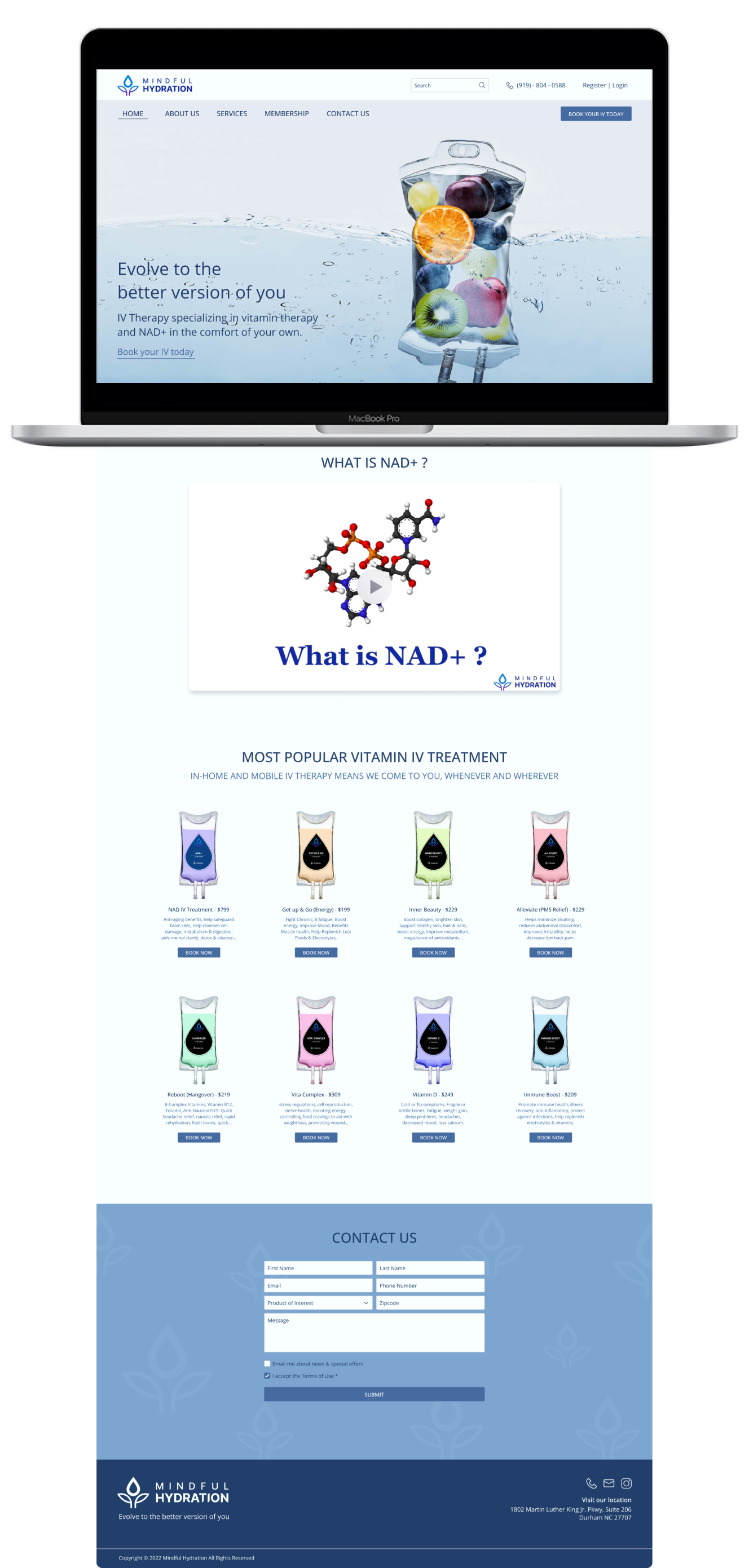
Mindful Hydration is a website for a start-up company in the health industry. It provides valuable details regarding IV therapy and book IV Infusion appointments at their comfort place.
Project Duration
August 2022 - September 2022
My Role
UX / UI Designer
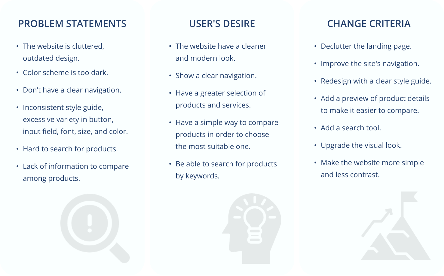
Problem Discovery
The current website has an outdated design that does not match the product's value. It comes with many bugs in terms of user interface and shows a lack of research user experience.
Goals
Design a new user interface that enhances the value of the products and the business, increasing website traffic and attracting new clients. Make it simple for clients to locate information and book IV Infusion appointments.
Major Improvements
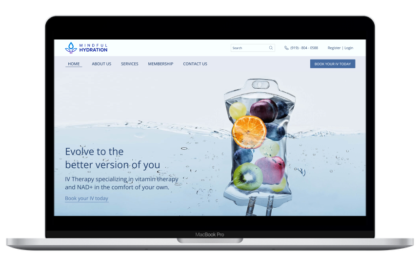
Header & Introduction Session
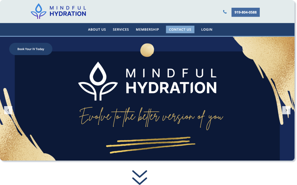
Old design's problem
1. The logo is oversize and leaning to one side.
2. The icon and phone number are out of alignment. The frame cause misunderstanding of it being clickable.
3. There is no “Register” option for new users.
4. The need to click the logo to return to the home screen leads to confusing navigation.
5. The most important button “Book Your IV Today" is not show up and is located in the area that most users will overlook.
6. There is too much contrast. The screen appears to be heavy and not user-friendly.
7. There is no introduction which explains what the website is all about hence.
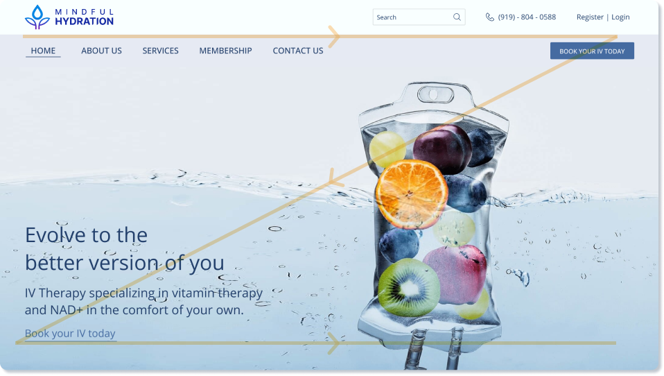
Redesign solution
1. User’s eyes will follow the orange line. All information is in sight, which reduce readability issues.
2. Add a search tool on top to allow users to search for products using keywords.
3. Add a “Register" option for new users.
4. Add a “Home" tab for a clear navigation.
5. Focus on CTA. "Book Your IV Today" appears twice to increase clickthrough rates.
6. Change the main picture and colors to create a new fresh and simple look.
7. Add an introduction line to describe the business and the website clearly.
Products Session

Old design's problem
1. The website's background color is grayish, giving off a gloomy impression.
2. There is a stark contrast between the background, header, and text color.
3. The grid and spacing is off.
4. The products are not arranged in a preference-based order.
5. There is no concise product description that allows customers to compare and choose.
6. The “Book Now” button is too big.
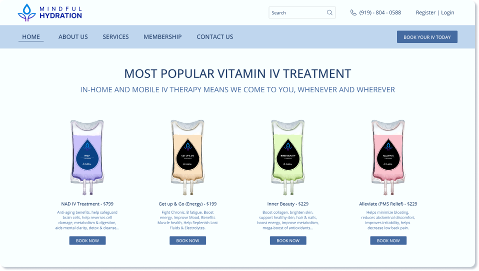
Redesign solution
1. Make the website's background a brighter, more contemporary color.
2. For a soft and subtle contrast, alter the background, header, and text colors.
3. Adjust the grid and spacing to create a straightforward arrangement with ample breathing room.
4. Arranged the products in a preference-based order. to attract more customers.
5. Add a brief description of each product to make it easier for customers to choose a suitable one.
6. Minimize the “Book Now” button to not compete with the “Book Your IV Today” button.
Contact Us Session

Old design's problem
1. The title “Contact Us” is left aligned, separated, and different from the other categories above.
2. Inconsistent style guide. The input fields, checkboxes, and buttons are designed differently from other screen elements.
3. The screen has too much contrast.
4. The checkboxes are located in the area that most users will overlook. Users have to move their mouse back and forth, which led to a lousy navigation website.
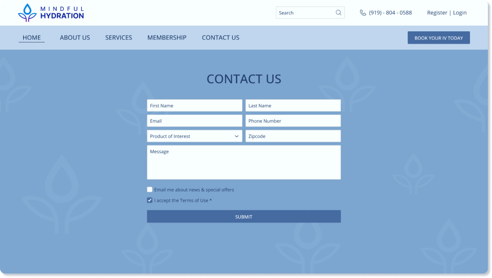
Redesign solution
1. Center title “Contact Us” to be consistent with the other categories above.
2. Stick to the style guide in order to make the design light, elegant, aesthetically pleasing, and easy on the eyes.
3. Change the colors of the background, input fields, checkboxes, and buttons for a light and smooth contrast.
4. Re-layout the input fields, checkboxes, and buttons logistically. Improve the site navigation.
Footer Session
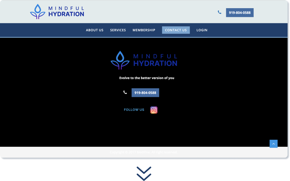
Old design's problem
1. Too dark and sharp contrast. Heavy on eyes.
2. The logo is not showing up enough.
3. Everything is out of balance and disorganized.
4. Copyright sentence can not be read because of the low contrast.
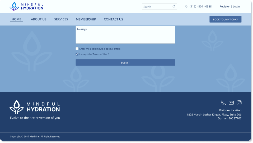
Redesign solution
1. Use simply two colors to create a straightforward and contemporary footer.
2. Use the light logo version to make it stand out.
3. Besides Instagram, add two more ways to contact: call and email.
4. Add the office location.
User Interview
Summary
To determine the website’s usability, I have conducted user-testing interviews to understand the users and their needs. The primary user group identified through research is middle class and above people with a high demand for health supplements, especially IV Infusion.
Competitors Analysis
A competitive study enables us to have a thorough understanding of how our rivals operate.
I research various IV therapy websites, evaluate their advantages and disadvantages, and consider the design choices made. This helped me when I was making design judgments.
I research various IV therapy websites, evaluate their advantages and disadvantages, and consider the design choices made. This helped me when I was making design judgments.
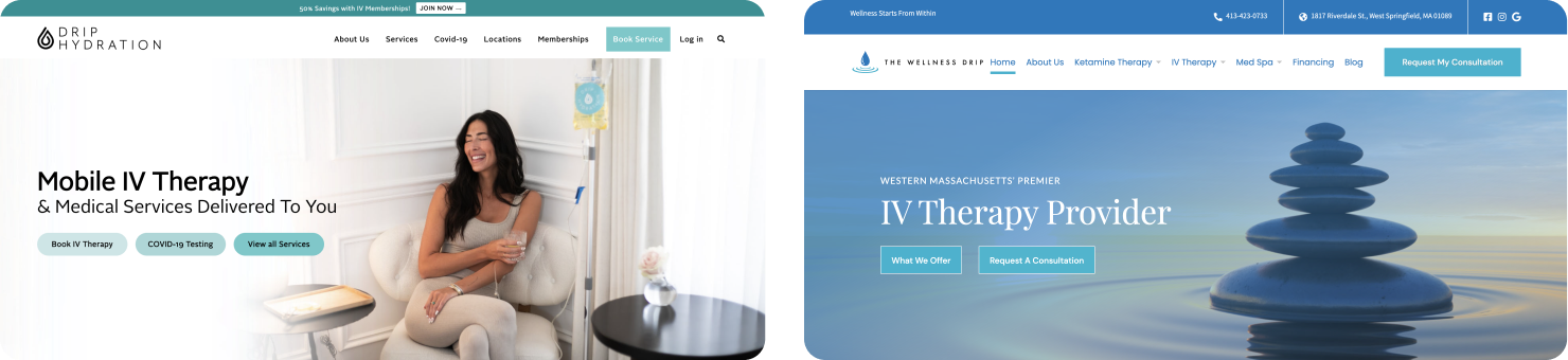
Drip Hydration The wellness drip
Key Takeaways
1. Every website has a fresh, attractive layout.
2. These websites have done a great job at utilizing whitespace.
3. With straightforward text and images, they concisely explain the facts for each topic.
4. Both of them provide subscription memberships for their services, which are prominently shown on the website's home page.
5. They also display customer reviews to win the respect and trustworthiness of potential clients.
6. The website had very straightforward site navigation.
7. However, there are too many categories on the landing page, which may cause readability issues for users.
Wireframing
Mi-Fi Wireframe

Style Guide
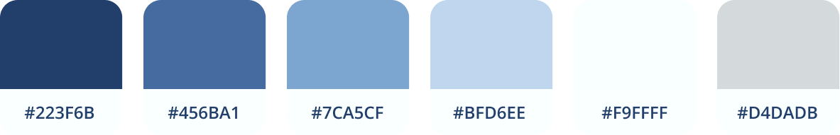
Color Palatte
The main color of the website is blue. Blue is associated with hydration, a fresh, bright vibe, and feelings of calm or serenity in the mind. By using this color, I was able to create a clean and simple looking landing page.
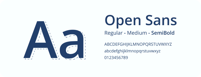
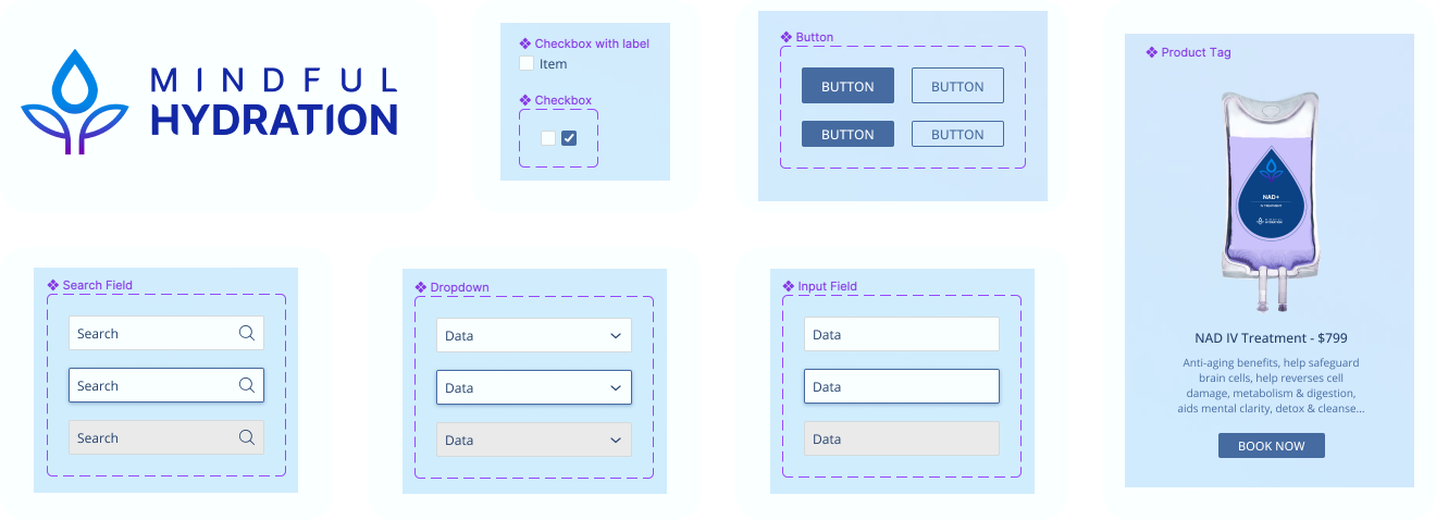
Typography
Logo & Components
Final Landing Page